Wednesday, September 26, 2012

PSA For SB: Slenderman

(Psss, Click on the images to make them larger so you can read c;)
With my storyboard, I went through a new version of my storyboard and then a basic speech placement.
From the original, I added a short description of what Slenderman is (for those of you that don't know). I also edited panels so the narrative would flow better and visuals would be present for the speech.
The final, refined version of my storyboard is:
The in between version from the first to the final is:
(It is not much different from the final)

And, the first ever version I did was this:
This on is what started this whole process.


Tuesday, September 25, 2012

d4m:: Final


What the last couple of weeks have led up too;
The final design for my Design4Media class.
Wa-la!


This took forever to finish!
While in the process of creating my finished piece, I'd decided to experiment with some other filters in PhotoShop.
Here are some examples:


A little darker with a purple/pink tint.


&This on is without the texture and the colors are brighter.


WIP
For my process in the final product, I first drew a rough sketch.

After I did this, I did the final line art.


After I've got the la art done, I start putting in the flat colors;

With the flat colors done, I can go in and so some shading.
After all of that, I have my finished piece.
Usually, I'll experiment with the final product to see if I can enhance it even more.

Sketches/Concepts

Some more sketches/concepts for my final design for my project.


Tuesday, September 18, 2012

Tension Animation; Concept

My my tension/anticipation assignment in Animation I, I first had to decide on a character or object to draw. I went through a couple ideals, but this was my final ideal:
So far, I have the basic design of a little girl. She is made of five colors with shading. For the animation, she is trying to pull a box of cats and things go wrong.

This image was just a rough of my beginning of my animation.
With the animation, the girl was changed and now looks older. She is lanky and seems pretty clumsy.
After Wednesday, I will be post the final animation I did for this.
See ya then! c;

Final Choice? Zombies

First, let me start of with my background, which I was missing from my last post:

With this background I could finally combine all my colors into an unified palette.
And since I didn't have a unified color palette last class; here it is now:

This was a combination of all my palettes in my lasts drawings, including my background colors.

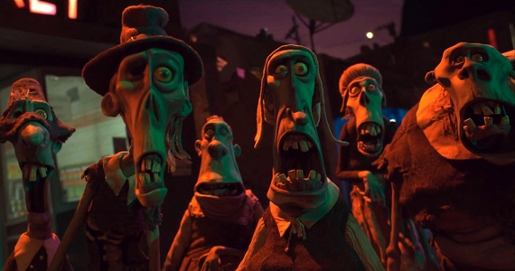
With this palette, I sketched out an ideal for my three zombie characters and colored it.
For the whole scheme, I found out that some of the colors didn't quite work with all the rest.
When I discovered that my initial unified palette wasn't really going to work effectively; I choose the main colors and created this:

This palette has the main flat colors that I used at the top and then on the bottom, I added my shade color to show how the palette becomes muted when the shading is added.


This is what my rough sketch for my composition looked like before I added the shading.
When I added the shading, the whole picture changed and became:

With further refining to my drawing, I hope to achieve my final result. 
At the moment, I'm getting the result that I wanted but, just not yet.

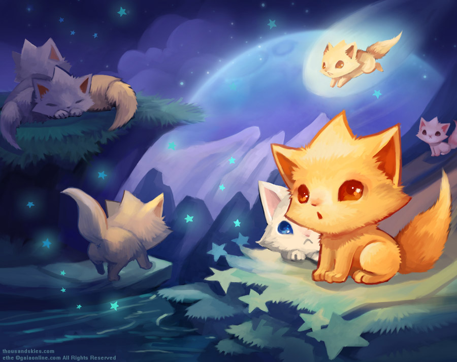
A plan to create more thumbnail sketches and play with the composition. They will all follow the relative color relationship in this one but, different.

Tuesday, September 11, 2012

D4M: Post 2


With my zombies, I dappled in three different, but similar palettes. For one of my zombie sketches, I stuck with my original idea of just dull colors. Realizing that it is a little boring and needs a 'PoP', I decided to experiment in adding brighter colors like the yellow and yellow-orange. Just to experiment further into a color scheme I used, brighter colors and stole from the palette of my 'Rats In Fancy Hats' idea.


With further research into my zombie color palette, I found the zombies from 'The Walking Dead' tv show and decided to look at their color scheme also.


With my 'Rats In Fancy Hats', I've decided to stuck with Marlena's palette of the brown. Also, with ethe's palette, I was going to incorporate that in the rats with their clothes and props.

Sunday, September 9, 2012

Ball Bouncin'

This is my first animation project for Animation 1. This was done in ToonBoom Harmony 9 (with headaches).

For whatever reason, there is a bit of lag that is not there in the original
Any clue on how to fix that? 

Tuesday, September 4, 2012

Design4Media: Menagerie Concept


First Idea:
ZOMBIES! Zombies may be the overdone genre in art, movies, etc., but I want to give it a shot. See if I can appeal to the zombie fan masses. c;


Zombie Theme Components:
 ;dull color scheme
 ;comical
 ;sunken faces

More sketches of these interesting monsters to come!


Daily Delights: source

Inspirations for my zombie design  are from the recent zombie, stopmotion animation movie, 'ParaNorman' by Laika.

artisancakecompany: source


Second Idea:
"Rats In Hats" or "Fancy Rats Must Be In Hats".
I have chose this idea for two reasons: 1. my initials are RAT and 2. rats are intelligent creatures that deserve more positive attention.

Rat Theme Components:
 ;rats are wearing hats
 ;wearing clothes (or doing jobs)


Inspirations for my rats are from both ethe and marlenakate on deviantart.


~ethe

She is an inspiration because of her color schemes in here work. They are very pleasant for the eye to view and they absolutely beautiful (in my opinion).
I've chosen her as an inspiration for my rats because, not necessary for the way she draws animals, but for the way she chooses colors.


~marlenakate

Marlena is also an inspiration because she has a very Disney-esque style in a lot of her work and I adore it. Her sketches are very animated and capture whatever the creature/person is doing.
I've also chosen her for my rat inspiration because of her sketching style.